
Buy and Hold CANSLIM?
Today’s blog post is going back in time to look at a weekly screen I posted on MSW exactly two years ago to the week. My screens and research have evolved since 2004 but anyone can access the archives of MSW for free if the date is prior to the current year (2006). So what benefit does looking back two years give any of us? I don’t know if it will benefit anyone but it is rather interesting to view the performances of the stocks without considering any money management or sell rules.
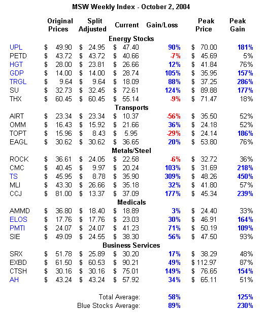
As a group, the 25 stocks are up 58% if you held each one to today (no rules). Of the 25 stocks listed (the stocks that still trade under that ticker), 20 of them are currently showing a profit if you were a buy and hold investor. If you only purchased the stocks that I highlighted in blue (details below), you would currently have an 89% gain and every one of the stocks would be in positive territory (UPL, HGT, GDP, TS, ELOS, PMTI, AH). The best performing stock from the screen is Tenaris (TS) as it has a current gain of 309% and a peak gain of 450% (from earlier in 2006). The combined peak gains for this weekly screen average 125% while the combined peak gain of the blue stocks average 230%. Not bad if you like to buy and hold without lifting another finger. I have owned several of these stocks over the past two years but I do not own any of the original shares from 2004.
The screen was based purely on CANSLIM methods that focused on earnings, relative strength and my own ability to read charts. That’s it – very simple. Three stocks have changed ticker symbols or no longer exist from the screen: (PKZ, DDN, LIFE).
What you may find very interesting is the fact that I was using the NH-NL ratio to gauge the market back then and it was working beautifully just as it does today. The catch phrase “Sell in May and Go away” was also prevalent in 2004. I was also looking for opportunities in specific sectors just as Energy stocks and Metal stocks were topping my list. The maximum peak gains are rather hefty from these two sectors and I enjoyed some of the gains. I still hear market “talking heads” pump these same sectors today as they seem to be extremely late to the party. No matter what anyone says, CANSLIM works and works very well when integrated with proper money management techniques.
Here was the general analysis from the screen and an excel spreadsheet highlighting the gains and losses. Please note the “split-adjusted” column as several stocks have split one or more times.
Weekly Screen for 9/27/04 – 10/01/04
Strong Sectors: Energy, Transports & Metals/Steel
Market Overview: The markets are starting to show signs of life. My research is starting to tell a story. The NASDAQ gained 2.4% on Friday to end the week. Volume turned higher on Friday as the NASDAQ showed the most conviction in months. New highs, a key to my research, are starting to ramp up.
Let’s look at the story deeper by using hard data to support strength:
Monday showed New Highs (NH) vs. New Lows (NL) at 171-124, not very healthy.
Friday Showed the NH vs. NL ratio at 498-33.
We have not had strength like this since April 5, 2004 when the market flashed a new high vs. new low ratio of 553-14. We have not had new highs top 500 since that day in April, about the same time the market was starting to go to sleep.
I wrote this entry on my Weekly Screens on April 19, 2004:
“Market Overview: The market is still in a confirmed rally according to rules but we are seeing many stocks hesitate and undecided about their direction. The world situation has been a big influence on the general market conditions. Speculation of an interest rate hike has kept the market in flux.
My screens showed bad news last week with the daily new highs and lows. For the first time since posting my screens in November, the daily new highs were lower than the daily new lows. I haven’t seen action like this since the bear market.”
My screens told a story then as they are telling a story now!
I have a new format for my weekly screens as the legend below will explain. Enjoy the work in the coming weeks as I post my weekly screens on this website. I have my own website that will launch in the coming weeks with daily screens, weekly screens and corresponding case studies that relate directly to the screens. On top of these features, I have an entire educational section for both fundamentals and technicals including top quality graphics (charts). Stay posted.
Legend:
Green Stocks: Excellent patterns, strong up-trends, supporting heavy volume, prime buying opportunities and solid RS lines.
Blue Stocks: Solid up-trends, nice volume, may be slightly extended, buying opportunity may still exist (refer to pivot and support levels).
Black Stocks: Confirmed up-trend, some sloppiness in pattern, extended from support areas, pattern may show weakening or slowing of advance, volume may be shrinking as stock advances, Stock may be a late stage base.
Red Stocks: Possible red flag in pattern.
Piranha
p.s. - one last thing; I am not a buy and hold investor but the "blast from the past" was fun!
Labels: CANSLIM
posted by Chris Perruna @ 9:50 AM
6 comments
![]()


6 Comments:
Chris,
these results are insane! Most of these stocks were in IBD back then, is that where you got them from?
You said you look for, "earnings, RS & chart patterns." Could you elaborate? Like Earnings over 30%? or? RS higher than market?industry? or?
Look forward to your reply,
thanks!
Yaser,
Yes, most of these stocks were in IBD. I get my fundamental screens from the daily graphs tool (custom screen wizard). I search for stocks with minimum EPS and RS ratings of 75-80 (depending on market strength). From these, I look to the charts and perform technical analysis (this is all based on personal interpretation of the charts based on my own experience). I am searching for trends and/or pattern setups that give potential opportunities.
Earnings and sales must be increasing quarter over quarter and year over year. Relative strength must be above 75 and increasing. I only select stocks from the top performing industries and sectors.
I use these same screens today to find the stocks I buy. The results from this screen were great but I have had my share of poor performing screens too. I am now doing some research to see if a long term outlook on CANSLIM stocks is legit. I buy and sell in shorter time frames but this proves that longer time frames may work as well if strong, healthy companies are selected.
This comment has been removed by a blog administrator.
Chris,
Thanks for sharing the details. Other than being good screens, I think the fact that the market was in a bull mode also helped.
Yes I am sure it helped but the main factor is the abundance of energy and metal related stocks in the screen. I was following the right groups at the right time. The NASDAQ closed at 1,942.20 (+14% since) and the DOW at 10,192.65 (+16% since). I will run the exercise with other dates in the future to see how valid the longer term results are.
Chris,
Good job there. I have got a question to ask you. When you are refering to RS ratings of 75+. Is that the RSI used in stockcharts.com or is that the RS used by IBD?
Post a Comment
<< Home