Market Talk with Piranha is currently moving to its new home at chrisperruna.com. The new site is up and running but many of the posts need editing as the images and stock charts did not transfer successfully (thanks blogger). I will post all new entries to both blogs – Thank you for your patience while I make this change!

Monday, October 30, 2006

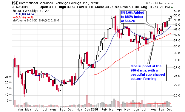
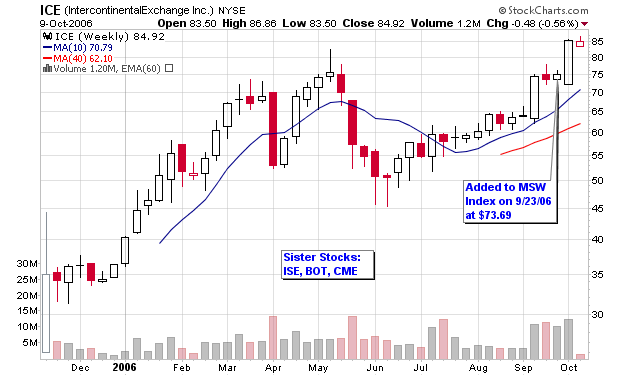
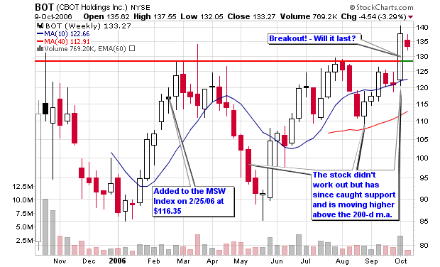
What is a Point and Figure Chart?

According to Investopedia, a point and figure chart is:
“A chart that plots day-to-day price movements without taking into consideration the passage of time. Point and figure charts are composed of a number of columns that either consist of a series of stacked Xs or Os. A column of Xs is used to illustrate a rising price, while Os represent a falling price. This type of chart is used to filter out non-significant price movements, and enables the trader to easily determine critical support and resistance levels. Traders will place orders when the price moves beyond identified support/resistance levels.

Additional points are added to the chart once the price changes by more than a predefined amount (known as the box size). For example, if the box size is set to equal one and the price of the asset is $15, then another X would be added to the stack of Xs once the price surpasses $16. Each column consists of only one letter (either X or O) - never both. New columns are placed to the right of the previous column and are only added once the price changes direction by more than a predefined reversal amount.” - Investopedia


I couldn’t have written a better definition myself so I feel comfortable using the one from Investopedia.com. I use point and figure analysis every night while scanning my charts because I can easily determine important support and resistance levels. As with any type of chart, many indicators can setup to offer buy and sell signals but I stick to the basics and only trade a few patterns that the point and figure charts offer.

Please understand that I use point and figure charts as a secondary technical analysis tool behind candlestick charts (both daily and weekly). When I find an interesting stock that has already passed my fundamental criteria and peeked my interest on the candlestick chart, I then view the point and figure chart (will be referred to as a P&F from this point forward). Support and resistance levels can be found using basic candlestick and bar charts but P&F charts eliminate the unimportant noise by setting-up the critical levels and breakouts or breakdowns with the more important (larger) moves.

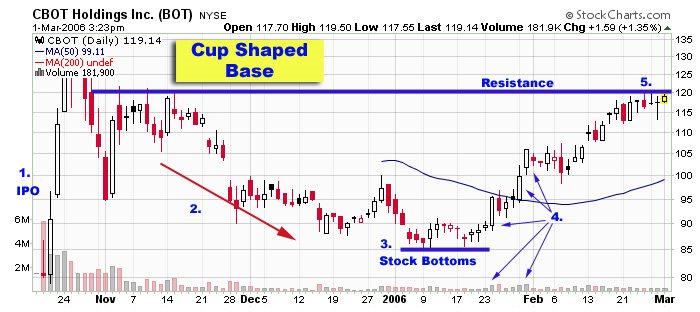
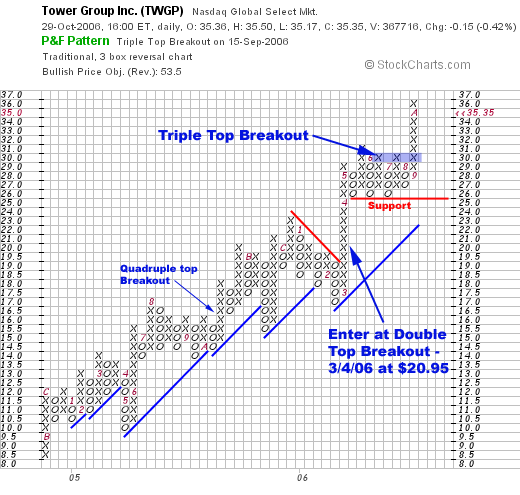
My favorite pattern setup is the Triple Top Breakout which occurs when a stock hits a certain level of resistance on three separate occasions, telling me that a move above this zone has some meaning. Not every triple top breakout will be successful but the odds of a breakout above this setup increase dramatically. As with all trading, you must take the signal with proper position sizing and set your stops without thinking like a human. Become mechanical and trade the setups; don’t trade your thoughts and don’t ever trade for pure money. You will be a lot more successful if you learn to trade the setups rather than everything else. The NASDAQ recently broke out of a triple top breakout but has since reversed (near the 100% retracement level on my Fibonacci chart – seen in other posts on this blog). Tower Group (TWGP), a long time favorite of MSW has recently confirmed another triple top breakout and has successfully moved higher since forming the resistance.


So what is the true definition of a triple top breakout?
According to StockCharts.com

A triple top breakout occurs when prices rise to a certain level and then retreat because the supply outstripped the demand at that level. Prices must rise back to the level on two additional occasions at which they retraced before. If prices continue to carry through that level, a triple top breakout has succeed and given a buy signal. Since this level previously acted as resistance, we now know that demand is currently exceeding supply and an entry area is born.

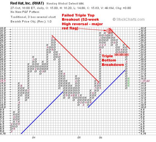
A triple bottom breakdown is similar to a triple top breakout except we reverse the rules and look for a breakdown where the price has retraced from the same area two times before (see the example of RHAT). This implies that the price level is a significant area of support and is an area where buyers are willing to buy the stock and create demand that outstrips supply. The breakdown below this level implies that the sellers are now creating more supply than there is demand and therefore the prices are breaking down.


A quadruple top breakout is similar to a triple top breakout, except that the prices break out after retracing from the same level three times. The fourth time the demand was able to outstrip the supply at the price level, and prices broke out with a quadruple top breakout. I have provided an example of this breakout with the chart of FDS (it actually setup five levels of resistance instead of four).

A quadruple bottom breakdown is similar to a triple bottom breakdown, except that the prices break down after retracing from the same level three times. The fourth time the supply was able to outstrip the demand at the price level, and prices broke down with a quadruple bottom breakdown.

Now let’s look to some further basics of the P&F chart (all explainations are provided by StockCharts.com):

Point & Figure charts consist of columns of X's and O's that represent filtered price movements over time. Their distinctive look may be alien at first to people who are more familiar with traditional price bar charts but once people learn the basics of P&F charts they usually become hooked.

There are several advantages to using P&F charts instead of the more traditional bar or candlestick charts. P&F charts automatically
Eliminate the insignificant price movements that often make bar charts appear 'noisy,'
Remove the often misleading effects of time from the analysis process,
Make recognizing support/resistance levels much easier,
Make trend line recognition a 'no-brainer',
Help you stay focused on the important long-term price developments,

On a P&F chart price movements are combined into either a rising column of X's or a falling column of O's. If you are familiar with standard chart analysis, you can think of each column as representing either an uptrend or a downtrend. Each X or O occupies what is called a box on the chart. Each chart has a setting called the Box Size that is the amount that a stock needs to move above the top of the current column of X's (or below the bottom of the current column of O's) before another X (or O) is added to that column. Each chart has a second setting called the Reversal Amount that determines the amount that a stock needs to move in the opposite direction (down if we are in a rising column of X's, up for a column of O's) before a reversal occurs. Whenever this reversal threshold is crossed, a new column is started right next to the previous one, only moving in the opposite direction.

It sounds much more complex than it is, trust me!

In a nutshell, as long as a stock is in an uptrend and it doesn't move down more than the 'reversal distance' (i.e., the box size multiplied by the reversal amount), the P&F chart will show a growing column of X's. Similarly, a stock in a downtrend will cause a descending column of O's to appear. Only when the stock changes direction by more than the reversal distance will a new column be added to the chart.

Traditionally, the box size is set to 1 and the reversal amount is 3 (this is exactly what I use when viewing my charts each night)

It is important to remember that a P&F Box does not represent a single value. Instead, it represents a range of values that is equal to the box size. The number on the vertical axis represents the value of the "floor" of the box. The "ceiling" of the box is equal to the floor plus the box size. If prices move anywhere inside that range of values, the box is filled in with an "X" or and "O" (keep reading for details).


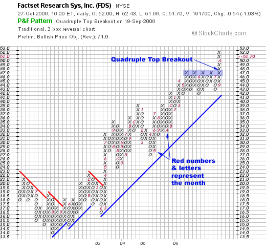
It is important to remember that P&F charts do not show time in a linear fashion. Each column can represent one day, or many days, depending on the price movement. Because P&F charts filter out the noise associated with more traditional charting methods, every mark on the chart is significant. The spacing between months, for example, will not be the same from month to month. Numbers and letters inside the chart itself indicate when a new month has begun. For instance, the number '2' shows where February started. The letters 'A', 'B', and 'C' are used to indicate October, November, and December. (I highlighted the months on the FDS chart where the number 5 is May and the letter A is October).

One of the best places to visit to start learning about P&F charts is through this link at StockCharts.com:
Understanding Point & Figure Charts

I also recommend the book Point and Figure Charting: The Essential Application for Forecasting and Tracking Market Prices, 2nd Edition by Thomas J. Dorsey

It was expensive in the past but the price has come down on Amazon to $37.77 but I would recommend buying it used for $19.99 or visit your local book store. The book is not on my recommendations page due to its former price of $59.95 which I felt was not worth my value. However, at $20, I highly recommend the book to anyone interested in learning about P&F charts.


Piranha

Labels: , ,

Tuesday, October 24, 2006

YTD Performances

In the charts below, I have grouped together the performance in 2006 of the three main indexes, major world currencies, commodities, specific industries and some sector spdrs in the charts below. I have always found it interesting and sometimes useful to watch the performance of major market indexes, sectors and industries. Charts like these can serve as macro views of the general market but don’t ever use these types of charts to pinpoint potential market tops and bottoms. I use them to help confirm action among the individual stocks that I am looking to buy or sell. Secondary indicators is all they are in my opinion.

Major Indexes:
$INDU – Dow Jones Indu., 13.16%
$SPX – S&P 500, 10.33%
$COMPQ – NASDAQ, 6.35%


Commodities:
$GYX - GSCI Industrial Metals, 57.87%
$GPX - GSCI Precious Metals, 14.35%
$GOLD – Gold, 12.74%
$WTIC - Crude Oil, -3.65%
$GJX - GSCI Energy, -8.06%


Currencies
$XBP - British Pound, 8.97%
$XEU – Euro, 6.09%
$XSF - Swiss Franc, 3.88%
$XJY - Japaneese Yen, -1.82%
$USD - US Dollar, -4.85%


US Industries
$XOI – Oil, 14.96%
$DRG – Drugs, 12.73%
$RLX – Retailers, 9.45%
$HCX - Health Care, 6.69%
$TRANQ – Transport, 6.42%
$SOX – Semiconductors, -7.31%


Select Sector SPDRs
XLU – Utilities, 16.25%
XLF – Financial, 13.39%
XLB – Materials, 11.77%
XLI – Industrial, 10.97%
XLK – Technology, 9.12%
XLV - Health Care, 7.66%


Piranha

Labels:

Monday, October 23, 2006

Strongest NH-NL Ratio Reading in Months

The NH-NL ratio surpassed its strongest weekly level since May 6, 2006 when it closed at 503-74. This was the tenth consecutive positive weekly ratio with new highs closing at 442 and new lows dropping below 30 for the first time in 2006. The weekly lows averaged 29 per day which gives us the lowest reading since the week ending July 30, 2005 when the market averaged exactly 28 new lows per day. The NH-NL ratio chart shows that last week gave us the highest reading (87.69%) since the week ending January 14, 2006 (87.97%). The past two weeks have spent time above the positive 80% calculation that I have explained on past blog entries (links below). The NH-NL ratio has gained strength for the past 10 weeks according to the number of new highs versus the number of new lows and is looking like a similar pattern to 2005.


Monday had a total of 636 new highs, the most new highs in one day since Monday, May 5, 2006 when the daily ratio closed at 745-38. The ratio continues to gain strength and individual leaders are moving higher (stocks on our MSW Index and the IBD 100) but many secondary indicators are suggesting that the market is still extended. The main secondary indicator that I follow is the number of stocks trading above their 50-day moving average on the S&P 500. It closed at 80.80% after reaching an intra-week high of 85.20%, the highest reading since the January 2006. The market didn’t peak for another four months after reaching the level above 80% in January and this is why the indicator remains secondary. When the NASDAQ finally turned, the percentage of stocks above their 50d- m.a. was closer to 65% in early May (it dropped below 50% the following week while the market took a plunge).

To calculate the percentage correctly, use this formula:
(New Highs – New Lows) / (New Highs + New Lows) * 100 = X%


Where do the Major Indexes stand in 2006?
NASDAQ: +6.21%
DOW: +11.99%
NYSE: +12.23%
S&P 500: +9.64%

Below is an updated look at the weekly averages for the NH-NL Ratio:
Saturday, January 14, 2006: 500-32
Saturday, January 21, 2006: 348-46
Saturday, January 28, 2006: 516-46
Saturday, February 4, 2006: 449-44
Saturday, February 11, 2006: 229-57
Saturday, February 18, 2006: 306-42
Saturday, February 25, 2006: 420-36
Saturday, March 04, 2006: 399-49
Saturday, March 11, 2006: 162-84
Saturday, March 18, 2006: 459-53
Saturday, March 25, 2006: 312-52
Saturday, April 01, 2006: 441-39
Saturday, April 08, 2006: 481-58
Saturday, April 15, 2006: 150-103
Saturday, April 22, 2006: 540-75
Saturday, April 29, 2006: 353-76
Saturday, May 6, 2006: 503-74
Saturday, May 13, 2006: 384-116
Saturday, May 20, 2006: 64-211
Saturday, May 27, 2006: 57-182
Saturday, June 3, 2006: 119-93
Saturday, June 10, 2006: 72-204
Saturday, June 17, 2006: 41-310
Saturday, June 24, 2006: 56-238
Saturday, July 01, 2006: 127-198
Saturday, July 08, 2006: 143-95
Saturday, July 15, 2006: 74-273
Saturday, July 22, 2006: 66 - 307
Saturday, July 29, 2006: 163-151
Saturday, August 5, 2006: 194-132
Saturday, August 12, 2006: 88-210
Saturday, August 19, 2006: 178-96
Saturday, August 26, 2006: 140-74
Saturday, September 2, 2006: 285-42
Saturday, September 9, 2006: 143-60
Saturday, September 16, 2006: 244-75
Saturday, September 23, 2006: 206-83
Saturday, September 30, 2006: 251-75
Saturday, October 7, 2006: 301-92
Saturday, October 14, 2006: 412-40
Saturday, October 21, 2006: 442-29 - This Week

Tuesday, September 19, 2006
NH-NL Ratio still Neutral

Monday, September 04, 2006
Looking at the Market through the NH-NL Ratio

Monday, August 14, 2006
New Highs and New lows telling a Story

Piranha

Labels:

Friday, October 20, 2006

Comeback Kids?

Due to last night’s loss by the Mets, I am going to call today’s screen the comeback kids. I am disappointed today as a baseball fan but I will get over it and look forward to next season with a young group of comeback kids (I also have my Giants playing the Cowboys this Monday night).

Are the stocks below a bunch of comeback kids?

Many of them are only a few years old and are gathering some support near their 200-d m.a. as the market looks to be forming its first pull-back or high handle. The market is overbought and extended so I am cautious with this type of a screen but it is important to look for stocks that can gain support above their 200-d moving average.

Many of these stocks are recovering or gaining price strength above their 200-d moving averages but their volume is not cooperating on the weekly chart which does raise a red flag. The stocks screened are ones that made positive gains yesterday, have respectable relative strength ratings and earnings ratings greater than 70% of their peers. Keep in mind that I may have left some solid candidates off of the list because the screen was only looking for stocks making gains during the day Thursday. All prices quoted are from the end of day Thursday.

Comeback Kids?
  • STLD – 58.69, nice support along the 200-d m.a. with increases in volume. The next short term buy is a move above $60
  • DRQ – 37.84, back above the 200-d m.a. as the stock is gaining some support with increased volume on the daily chart
  • FTI – 60.25, this chart is very similar to the first two stocks listed today as the 200-d m.a. recovery is underway but weekly volume is not above average
  • BRG – 65.84, after five months of consolidation back to the 200-d m.a., the stock is moving higher on increased volume. Could be a $60-$100 setup
  • GPI – 50.16, the stock corrected about 30% from its high and is now trending back above its long term moving average. Short term buy is a move above $52
  • BUCY – 49.40, the recent and former MSW Index stock is back above the 200-d m.a. but volume is lower than the distribution weeks.
  • ANDE – 38.30, the stock has corrected by 50% since its high above $62 and is now gaining support along the 200-d m.a. with a possible deep cup pattern forming
  • EXPD – 48.11, another one of those CANSLIM type stocks that corrected to the 200-d m.a. after a nice run and is now trending higher. The trend buy is along the moving averages
  • VMC – 84.20, building a five month cup shaped pattern with recent support at and above the 200-d m.a. Volume has been light so be skeptical.
  • AEM – 33.25, riding the 200-d m.a. with a short term entry on a move above $34. Once again, I would like to see volume increases to confirm the move
  • NTG – 32.72, the stock fell below the 200-d m.a. for the first time in years but is fighting to get back above (volume has been light)
  • OXPS – 30.19, the former MSW Index stock is back above both moving averages and is gaining volume strength on the daily chart but not the weekly chart.
    DB – 123.58, a cup with handle base above the 200-d m.a. with a pivot point of $125.42
  • MDR – 44.36, a long time superstar that has been riding above the 200-d m.a. for the past couple of years with its first challenge of support in September. The stock caught support and is looking to recover its 50-d m.a. but daily volume is low. I would wait for a new 52-week high before becoming interested.
  • DAKT – 22.42, the stock took a hard fall in August back down to the 200-d m.a. but has since caught its footing. The trend buy would be now with proper sell stops in place
  • TTI – 25.95, the stock has consolidated through out 2006 with recent support near the 200-d m.a. and is now attempting to stay above the long term average. Volume has dried up, so watch the RS line carefully
  • HSC – 82.20, a strong stock from 2005, Harsco has consolidated in 2006 and is looking to gain some strength here above the 200-d m.a.
  • ADM – 37.90, a great stock from late 2005 until mid-2006 with a recent correction back to the 200-d m.a. It seems to be getting some support at the long term support line but must recover back above the 50-d m.a.
  • TS – 37.71, one of the top performing stocks on the MSW Index in 2005 and early 2006 but was recently removed due to lack of strength and a declining RS line. It has since recovered the 200-d m.a. and will stay on my radar.


Piranha

Thursday, October 19, 2006

Let's GO Mets GO!


Game 6 was awesome (almost as good as game 7 of 1986, I was there) - now we need a big win in game 7 of the NLCS!

LET'S GO METS!


Piranha

Tuesday, October 17, 2006

Is BOT the Next CME? - March 1, 2006

I wrote a blog post one week ago today reviewing the CBOT case study I did back in March 2006 which was originally titled:

Is BOT the next CME

After today, BOT is now part of the Chicago Mercantile Exchange Holdings Inc. (CME)!

The world's biggest financial exchange announced on Tuesday it would acquire rival CBOT Holdings, Inc. (BOT) for more than $8 billion in a deal that would combine the two largest U.S. futures exchanges.

It’s funny and ironic that I also just posted up a thread on Tuesday, October 10, 2006 titled: Exchange Stocks: ISE w/ ICE & BOT

When your hot, your HOT!

Piranha

p.s. - This could be a great story over at WallStrip - What do you think guys and gals?

Calling the NASDAQ Bottom

I‘ve had a question through e-mail about my Fibonacci retracement charts and how they were late to calling the bottom of the NASDAQ market. That is fine because I don’t need to spot the "exact" bottom of a market, I just need to spot the reversal and hop on. Those of you that follow MSW and this blog on a weekly basis do know that one of my strongest talents is nailing market reversals when they happen because it’s something I have done for years while investing in CANSLIM type stocks.

So, I invite everyone to visit this post titled: Déjà vu on the NASDAQ? posted up on Wednesday, July 26, 2006 and determine for yourself if I did see the bottom developing.

Here is some of the text from that blog entry and the chart I posted almost three months ago (July 26, 2006) and an updated chart from my annotated stockcharts file:


7/26/06: “As I was researching my archives on MSW (the archives from 2004 and 2005 are open to everyone) I found some interesting data that correlates the NASDAQ in 2004 and 2006. So far in 2006, we have had 15 down weeks and 14 up weeks. At this time in 2004, we had 19 down weeks and 10 up weeks and the NASDAQ was at a nine month low (very similar to now as we are near 10 month lows). In 2004, my daily and weekly screens started to turn south on May 9th; in 2006, they started to turn south on May 15th (about the same time).

If you look at the two charts presented in this blog entry, you will notice how the market started to weaken in May and June and with a bottom near the end of July into early August. This summer is not over but I am wondering if the pattern will turn out to be similar to the one from 2004. The old saying: “sell in May and go away” has held up over the past couple of year with opportunities resenting themselves during the fall (towards the end of October).

Several of things I was saying back in 2004 are very similar to what I have been saying over the past two months. The similarities are amazing and the current NASDAQ chart may be forming a pattern that could take a similar route as it did in August of 2004. Only time will tell but history repeats and traders are always learning from history.

NOTE: when I say history repeats; I am not saying that it repeats exactly but the charts do resemble similar formations and seasoned traders and investors can capitalize on these situations.”

Click the link for the rest of the post! Déjà vu on the NASDAQ?
Piranha

Labels:

Monday, October 16, 2006

NASDAQ followed the Fibonacci Levels

While doing my research this week, I really highlighted how the NASDAQ weekly chart has briefly stalled for one week at each of the three Fibonacci retracement levels. I have been covering the chart since mid-August here on the blog as the index has continued to push higher and stall briefly at the 38.2%, 50.0% and 61.8% levels. With the next recognizable level at 100%, the index has moved higher for three consecutive weeks without a stall.


Is this coincidence or is this human nature in action?

I have highlighted the three brief resistance weeks in color while the NASDAQ regrouped before moving higher. It’s an interesting chart that shows how the market corrected at each level on lower volume than the previous week which gave us a clue that the NASDAQ wanted to move higher.

Let’s wait and see what will happen when it reaches the 100% level. Will this be the final push higher and the first major signal of a market reversal?

I covered the chart on the blog in these posts as it materialized in real-time:

8/16/06:
NASDAQ looking for Retracements

8/17/06:
NASDAQ creating Trading Opportunities

8/24/06:
Using Fibonacci Retracements

8/31/06:
Current Market Temperature

9/15/06:
Weekly Market Review

10/04/06:
Talking Heads at it Again!

Piranha

Labels:

Thursday, October 12, 2006

Am I a Stock Picker?

I’m a little late to this party but I was reading the blogs debating the issue of posting stock picks and not posting stock picks. My thoughts on the subject tend to agree and disagree with some of the points and comments on those blogs but I can only explain what I do.

Here were the original blogs to debate the subject:

Taz Trader Blog: 6 Reasons Why There Are No Stock Picks

FallondStockPicks.com: Why stock selection *is* important

I write this Market Talk with Piranha blog as an add-on to my main equity research site MarketStockWatch.com. I don’t provide “stock picks” at MSW but I do supply my members with daily and weekly screens and an MSW Index. Maybe I am taking the easy way out but my screens are designed to do the actual research work for investors that don’t have the time to compile the research or some members that are just learning to invest. I integrate specific screens with educational aspects that I have learned while trading my own accounts. I do list individual stocks and I place pivot points, entry areas and sell stop areas but I don’t highlight specific stock picks for them to buy (that is up to each individual investor). One of my main goals is to teach novice investors how to develop their own method of screens by using some of the things I currently do. This will enable them to invest for themselves for the rest of their life and become their own “stock pickers”.

A typical daily screen may contain anywhere from 5 to 20 stocks in one night that meets the criteria of the screen. A couple of my favorite and most successful screens for finding winners is “Interesting Stocks making New Highs” and “Strong Stocks within 15% of a New High”. I run several computerized fundamental screeners to narrow down approximately 7,000 stocks to about 100 candidates and then perform the technical analysis. My service derived from the actual research I performed for myself each night when trading my own account using a modified CANSLIM approach. I shared this research on a weekly basis for a couple years on several free internet forums and then decided to format it and charge a fee for doing all the tedious work (after the idea was given to me by a reader). I trade and we all know that trader’s income isn’t consistent so a research service made complete sense since the work was already done each night for me. I am also an entrepreneur so the idea of an additional income stream made complete sense for me and my family and I did not feel selfish for charging a price. I perform work while filling a niche and I do expect to be paid as long as it benefits the people using it. They wouldn’t pay me if it didn’t benefit them and I would close shop if the service was no longer in demand.

However, I am seriously considering moving to a free platform in 2007 while using advertisements in the form of Google Adsense and the like to cover my expenses and time for formatting my research. This would eliminate charging members and would allow me to expose my work (which I feel is excellent) to a wider audience. Over 600 people have signed-up for MSW since officially opening in January 2005 and I am extremely proud of the fact that I created this business from thin air. Whether I charge membership fees or post up my work for everyone, I don’tmake specific stock picks for anyone. I give them research based on a set of criteria that includes fundamental and technical analysis.

Essentially, I make stock picks each night but its’ up to each individual member and investor to make their own choices based on the stocks presented. I will not and do not form an opinion or bias towards any one stock (at least I try). Members ask me questions and I tell them what I see based on my own beliefs about the market. One of the most important rules I teach to my community is the use of money management rules and the fact that many of the trades they put on will actually be losers. I do have a section titled “All-star stocks” to help promote the service (it is a business) but that by no means indicates that I only screen winners. I always admit when I am wrong and eliminate losers on a monthly (and sometimes) weekly basis and explain why they are being removed. The toughest aspect to teach new investors is the fact that they will have to accept losers. This is by far the toughest idea for novice investors to comprehend and integrate into their system. By teaching position sizing techniques and expectancy, most people come to realize that it is okay to lose but you will always find a few people that want winners at all times and always want to be invested.

So, do I support stock picks?

What ever floats your boat! Do what you love to do and do what you feel help others. Some people like stock picks and some don’t. I like to provide researched screens that take both fundamental and technical criteria into consideration and I love the fact that every stock that ever makes one of my screens was studied by my own eyes on the charts.

My modified CANSLIM screening strategy can be found though this link:
Buying and Screening Strategy

I’ll attempt to teach you about investing and provide you with opportunities you wouldn’t otherwise find!

I guess I am a stock picker but I will never tell you what to buy or sell.

Piranha

Wednesday, October 11, 2006

Can CANSLIM be Programmed?

What exactly is CANSLIM? And can it be mechanically programmed?

Here is the brief definition from their website:

C= Current earnings per share should be up 25% or more and in many cases accelerating in recent quarters. Quarterly sales should also be up 25% or more or accelerating over prior quarters.

A= Annual earnings should be up 25% or more in each of the last three years. Annual return on equity should be 17% or more.

N= A company should have a new product or service that's fueling earnings growth. The stock should be emerging from a proper chart pattern and about to make a new high in price.

S= Supply and demand. Shares outstanding can be large or small, but trading volume should be big as the stock price increases.

L= Leader or laggard? Buy the leading stock in a leading industry. A stock's Relative Price Strength Rating should be 80 or higher.

I= Institutional sponsorship should be increasing. Invest in stocks showing increasing ownership by mutual funds in recent quarters. IBD's Accumulation/Distribution Rating gauges mutual fund activity in a stock.

M= The market indexes, the Dow, S&P 500 and Nasdaq, should be in a confirmed up trend since three out of four stocks follow the market's overall trend.


So, can this be programmed? Sure it can but I would urge some changes to fit exactly what you are looking for! Here is how I would simply break CANSLIM down to enter it into a mechanical system:

C= quarterly earnings 25%+ versus last quarter, sales should also be up 25%+ versus last quarter
A= Annual earnings 25%+ for three consecutive years, ROE must be 17%+
N= within 15% of new high
S= minimum daily trading volume is set to 40,000 shares*
L= RS rating of 80+
I= Increased institutional support along with net positive shares**
M= NH-NL ratio must be positive for longs (my criteria)

This can be programmed (of course itis still simplified)!

*Volume should exceed 150% average volume on breakout days and strong accumulation days (up-days)

**Just because more institutions own the stock doesn't mean that the net number of shares bought versus sold was positive! Criteria can be set for this level (maybe you want an increase by 5% or 10%)

Piranha

Labels:

Tuesday, October 10, 2006

Exchange Stocks: ISE w/ ICE & BOT

Case Study
10/10/2006
ISE – International Securities Exchange Holdings Inc.

Industry: Financial Services

The company provides a fully electronic securities exchange for listed equity and index options. Sister stocks such as ICE, BOT and CME have been gaining strength over the past month as several of them are members on the MSW Index so I thought it would be a good time to write a case study and give them all the kiss of death (a joke of mine). I have had a history of writing case studies for stocks I own and cover that were performing nicely only to see them decline after the analysis. For example, I wrote a very detailed case study on BOT back in March (near the peak) which was uploaded to this blog earlier today. The stock corrected before rebounding over the summer and has recently blasted to new highs on above average volume. If all things hold true, this should be the top for ISE as I have just jinxed the beautiful cup shaped pattern.

Sister Stocks:
IntercontinentalExchange - ICE
Chicago Mercantile Exchange – CME (P/E: 48)
CBOT Holdings – BOT (P/E: 62)
Cash America Intl Inc. - CSH
First Marblehead Corp - FMD

Key Ratings:
Overall Rating in IBD: A+
EPS Rating: 95
Relative Price: 97
Industry Group Rank: 52 (of 197)

3-Year EPS Rate: 28%
3-Year Sales Rate: 24%

ROE: 26.53%
PEG: 1.87 (too high for my tastes!)
P/E: 36.3

EPS Analysis (yearly):
2002: 0.04
2003: 0.60
2004: 0.77
2005: 0.93
2006: 1.33 (estimate)
2007: 1.59 (estimate)

Revenue (in millions):
2002: 73.41
2003: 100.5
2004: 125.4
2005: 155.9

Net Income (in millions):
2002: 0.80
2003: 20.2
2004: 26.1
2005: 35.3

Pretax Income (in millions):
2002: 3.60
2003: 36.0
2004: 51.7
2005: 65.1

Cash (in millions):
2003: 92.9
2004: 171

Cash Flow (in millions):
2003: 21.6
2004: 30.1
2005: 41.4

Number of Institutions (last reporting period):
% Shares held by Institutions: 62%
Total Institutions: 295
Money Market: 114
Mutual Funds: 172
Other: 9

Top Institutional Holder: Bamco, Inc. (3.5 million shares) 0.02% of portfolio

Some of the fundamental causes for concern are the above average price earnings ratio versus the entire industry and the S&P 500 and the high price to book value which almost doubles the industry standard and triples the average on the S&P 500. The current price of the company must be considered a premium when compared to the industry and the market.

Does this matter?

According to William O’Neil, strong stocks must be bought at premiums just as luxury items in life are bought at premiums. Competition is moving in on the company as the profit margins are shrinking within the industry.

Moving to technical analysis, we can see that most of the stocks in the industry are moving higher and ISE is forming a beautiful cup shaped pattern that has formed over the past seven months. The top of the right side of the pattern should come to a close near $50-$52 and then form a handle in order to shake out weak holders. The 200-d m.a. has been acting as support while the right side of the base forms so look to this area as a fall-back zone if the stocks decides to correct.

Both ICE and BOT have moved on to new 52-weeks highs so ISE may be seen as the laggard but the base is great. As long as a handle forms and a pivot point is established, I will enter at the ideal time only if the “M” in CANSLIM is cooperating. The major indexes are extended so I am not sure if this will all come together at the proper time but it is a very interesting development to watch. The stock is already up over 15% in six weeks on the MSW Index so we can always take profits if things turn badly!

Piranha

Review: CBOT Holdings Case Study (March 2006)

I wrote a detailed case study on CBOT Holdings back in March 2006 and wrote a brief blog post titled Is BOT the next CME? but I picked the stock near its peak and was forced to sell. It rebounded over the summer months after it’s collapse and has recently blasted to new highs. The entire sector is acting with strength so I have decided to write another case study about ISE which will be uploaded later in the day. Note one major thing about institutional holdings: 3% of the shares were held back in March for a total of 138 institutional investors; that number has increased to 16% held with 204 institutional investors now owning shares (Scout Capital Management is now the top holder with more than 1 million shares).

Here is what I was looking at back in March 2006 with BOT:

CASE STUDY – Another successful Exchange Stock?

3/1/2006
BOT – CBOT Holdings Inc. CL A

Industry: Financial Services

Company Profile:
Cbot Holdings, Inc.. The Group''s principal activities is to derive exchange based on contract volume with global listed futures and options on futures contracts. The Group operates in two reportable segments: Exchange Trading and Real Estate Operations. The exchange trading segment primarily consists of revenue and expenses from both the electronic trading and open-auction platforms, as well as from the sale of related market data to vendors and from clearing services. The real estate operations segment consists of revenue and expenses from renting and managing our real estate. We allocate indirect expenses to each operating segment. – profile published by Ameritrade

Analysis from the first week it was added to the MSW Index (2/25/06):

Price on 2/25/06: $116.35
Buy Point: $122.00
Support: $105.00

The stock looks expensive but the market is in favor of financial stocks and especially exchanges (take a look at CME – I missed that one on the move from $60 to $425 over the past two years). The recent IPO is about to challenge the 52-week highs as it sits 13.5% from that high. I found it through a search for stocks within 15% of a new high with solid fundamentals. My Target is $175 for the next 6-12 months.

Sister Stocks:
Chicago Mercantile Exchange - CME
International Securities Exchange – ISE
Asta Funding – ASFI
Global Payments – GPN
Euronet Worldwide - EEFT

Key Ratings:
Overall Rating in IBD: A+
EPS Rating: 98
Relative Price: 87
Industry Group Rank: 27 (of 197)

3-Year EPS Rate: 25%
3-Year Sales Rate: 12%
ROE: 15.98%
PEG: 2.88 (very high)
P/E: 108.95 (cause for concern)

EPS Analysis (yearly):
2004: 0.80
2005: 1.53
2006: 2.53 (mean estimate)
2007: 3.09 (mean estimate)


Revenue: (in thousands)
2002: 308,273
2003: 381,302
2004: 380,193
2005: 466,573

Net Income: (in thousands)
2002: 34,311
2003: 30,707
2004: 41,985
2005: 76,543


Pretax Income (in thousands):
2002: 59,033
2003: 116,814
2004: 74,223

Total Assets (in millions):
2003: 483,981
2004: 460,416

Long Term Debt:
2004: 31,074
2005: 10,716

Number of Institutions (last reporting period):
% Shares held by Institutions: 3%
Total Institutions: 69
Money Market: 49
Mutual Funds: 19
Other: 1

Top Institutional Holder: Mazama Capital Management, Inc. (606,932 shares) 0.01% of portfolio

Chart Legend:
The stock debuts with an IPO in October 2005 and quickly reverses from an intra-week high.
  • A two month downtrend ensues as the stock drops on decreasing volume.
  • The stock bottoms in early January, 2006 as volume dries to it’s smallest weekly level ever
  • The next four weeks tick up with increasing volume (several accumulation weeks can clearly be seen)
  • The former resistance set near the IPO stops the stock in its track below $120.
  • A buy will take place on a strong move above $120-$122 (note how the RS line is reaching new highs)

  • Piranha

    Wednesday, October 04, 2006

    Talking Heads at it Again!

    As we all know the DOW set a new record close by finishing at 11,727.34, surpassing the prior closing high of 11,722.98 set back on January 14, 2000. The index was up 0.5% or 56 points as crude oil fell to a 14-month low based on assumptions that lower energy prices may boost consumer spending and hold off an economic slowdown. The NASDAQ was up 0.3% to close at 2,243.65 as it is still miles away from all time high that was set back in 2000 at 5,132.50. The S&P 500 closed at 1,334.11, up 0.2%, as it is within a short distance of its all-time high of 1,553.11.

    With all of the excitement surrounding the new closing high, I would like to focus on what the “Talking Heads” are saying. What is a talking head? Please see a post I wrote years ago titled: Ignore “Talking Heads” because they are usually wrong!

    Here are some quotes from talking heads today:

    • “Now that you have a definitive new all time high, the fact that it is the Dow and the most recognized index, that is the type of thing that will shine the spotlight on the market,” said Charles Carlson, who oversees $105 million at Horizon Investment Services LLC in Hammond, Indiana, and who wrote “Winning With the Dow's Losers,'' published in 2004. “This could get people interested in stocks.”
    Read that last quote! “This could get people interested in stocks”. The only people that get interested at this point in time is dumb money! When “people” such as your mother-in-law, the barber and the taxi driver start talking about the DOW and its all-time high; it’s probably time to get ready for a huge blow-out where smart money takes advantage of dumb money and laughs all the way to the bank. Be careful out there because the wheels will fall off when “people” get interested in stocks.

    Another ‘talking head” on a major financial site:

    • "Investors are concluding that the economy is in for a soft landing," said Hugh Johnson, chairman of Johnson Illington Advisors. "They expect the good news about the decline in oil prices to offset the negative impact of a deteriorating housing market."

    • “What's most interesting”, Davidson said, “is not that the Dow has broken through to a new record, but that it has taken the market this long to get to a point at which stocks seem to be fairly valued relative to earnings expectations.”


    Who cares, analysts were saying Enron was a buy and fairly valued at $60 before its infamous decline. By the way, talking heads recommended Enron all the way to $12 per share from $60.


    • Scott Wren, senior equity strategist at AG Edwards was cautious about the importance of the Dow’s milestone. “It’s probably of more significance to the retail investment community than it is to the professionals,” he said.

    • “But I do think its a psychological plus and one that could spark some interest and maybe bring a little bit of sideline money into the market.”

    From MSW Money:
    Twenty-three of 30 stocks in the Dow were higher on the day along with 304 S&P 500 stocks.


    • The rally is a reflection of investor "belief in the sustainability of growth," Maury Harris of UBS Securities told CNBC's "Power Lunch." While the economy may be slowing, it will be a modest pullback at worst, he said. And, added Peter Hooper of Deutsche Bank Securities, investors believe the Fed won't be cutting interest rates but will step in to support the economy.


    When I hear things like this, I start to lick my chops and get ready to short the hell out of the market. These talking heads don’t know what is going on and continue to pump a market and economy that is extremely extended and due for a pull-back. I really don’t know when that correction will start but it will and I am jumping on at the first signal. To be honest, it could take, three days, three weeks or even three months – I don’t know but when it does happen, I put my cash to use!

    As many traders have noted, such as Trader Mike, the $SOX or semiconductor index is performing poorly which usually casts some foreshadowing of what’s to come. In addition to the $SOX acting poorly, small caps and other bull market leaders are not stepping to the plate to propel the indexes higher. The NH-NL ratio is weak and is not participating in this rally run and that sends the largest red flag in my opinion. Without the support of small cap growth stocks, you wouldn’t expect this rally to continue. I have been bearish on the Ticker Sense Blogger Sentiment Poll for the past four weeks as the market has moved higher and remain that way.

    Some sectors acting poorly on Tuesday were energy stocks, computer hardware and gold stocks. Sectors moving higher Tuesday included airlines (they typically move higher when oil stocks move lower), brokers and some medicals.


    Marvel Technology (MRVL) led the semiconductor group lower as it gapped-down and closed with a 12% loss on the largest daily volume in months. The stock is back below its 50-d moving average and is well below its 200-d moving average. The proper CANSLIM short should have come when the stock failed to recover the 200-d m.a. back in mid-June. Similar to the stocks listed on last night’s MSW screen, MRVL can be a poster stock for what to look for in possible shorts.

    I have included some charts of the major indexes which shows why I am looking for a pullback and why my screens are focusing on potential shorts.
    Piranha